
The box art for Pokemon Legends: Z-A was recently revealed, and it’s absolutely gorgeous. The only problem is, it looks substantially better on the original Nintendo Switch. The new Pokemon game made me realize just how much of an eyesore the Nintendo Switch 2 Game Box design actually is.
Switch 2 Game Box Is Kind of Ugly
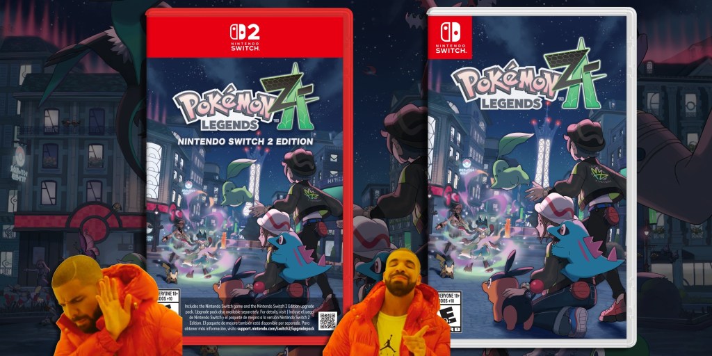
On May 28, The Pokemon Company surprised fans by finally announcing the release date for Pokemon Legends: Z-A. However, the developer also unveiled the box art for the highly anticipated RPG as well. While the Pokemon Legends artwork is genuinely incredible, I immediately noticed just how bad it looks with Switch 2’s packaging. This was especially apparent when you compare it side by side with the original Nintendo Switch game box.
Videos by VICE
At a glance, the biggest issue with the Switch 2 game box design is the ugly red borders. I particularly am not a fan of the top portion, which takes up too much real estate on the box. Not to mention the wall of text on the bottom. I mean, the whole point of game boxes is to let the artwork sell you on what the game is about. But with the Switch 2, the red border and bottom text are not only the star of the show, they practically crush the artwork beneath their weight. Maybe this sounds exaggerated, but it truly looks off.
If you don’t believe me, I recommend looking back at the original Nintendo Switch box art designs. In the old boxes, the artwork actually takes up the entire box. It’s actually beautiful in comparison. While some fans have been critical of the design since the Switch 2 was first announced back in April, I think I finally noticed it because of how beautiful the Pokemon Legends: Z-A artwork actually is. Seeing it cropped and squished so badly hurts my soul.
Why Is the ‘Pokemon Legends: Z-A’ Game Box so awful?

Outside of subjective taste, I have a theory for why the Switch 2 game box design looks the way it does. It’s actually a pretty simple reason if I’m right. But I think the giant, gaudy red borders are so that average consumers don’t confuse Switch 2 games with Switch 1. Both consoles share the same name and look incredibly similar. So, Nintendo wanted to make sure that there was no mistaking what is and isn’t a Switch 2 game.
Interestingly, this isn’t the first time this topic has been brought up. Recently, a tweet by gaming YouTuber BeatEmUps went viral when he brought up how similar the Switch 2 and Switch 1 console packaging looked. The creator sparked a debate online about general audiences not being able to tell the difference. Of course, this could lead to casual consumers purchasing the wrong system this holiday.
However, it does make you wonder why Nintendo would go to such great lengths with the Switch 2 game box but not the console’s packaging. I mean, while $80 games are expensive, imagine dropping $300 on the wrong device. Regardless of the reasons for the design, it looks like we are stuck with the ugly Switch 2 game boxes for this generation. All I know is I’m going to be buying a physical copy of Pokemon Legends: Z-A on Nintendo Switch 1. Just so I can let its beautiful artwork shine when it’s on display in my room.
More
From VICE
-
De'Longhi Dedica Duo – Credit: De'Longhi -
We Are/Getty Images -

Photo by tang90246 via Getty Images -

Credit: SimpleImages via Getty Images